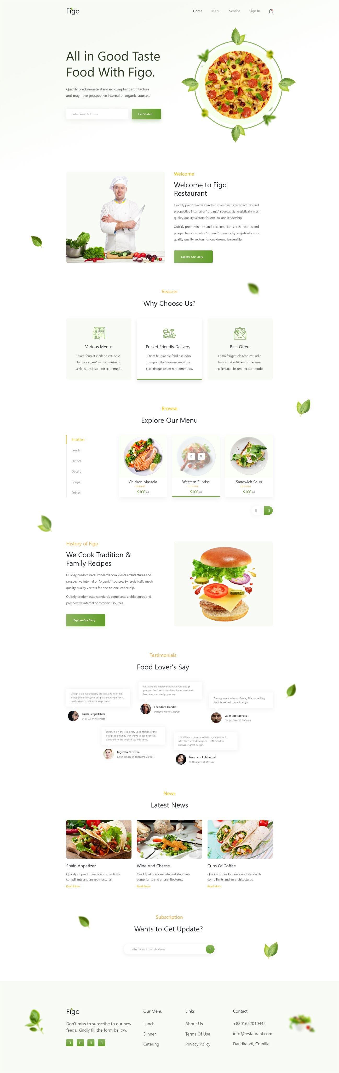
A UI/UX design for a restaurant brand — menu, story, ordering and reviews in one warm, food-led page.
Figo is a restaurant that needed a page doing the job a printed menu cannot: making someone hungry, then making it easy to act on it. We designed the full landing experience, from the first plate on screen to the booking.
Most restaurant sites open with a PDF menu and a phone number, which is the fastest way to lose an appetite. The design had to lead with the food and keep the practical detail close without letting it take over.
A light, airy layout with cut-out food photography floating over the page and a leaf motif tying it together. The menu is browsable by service — breakfast, lunch, dinner, dessert, soups, drinks — with dishes priced on the card, and the kitchen's story, reviews and a news strip sit underneath. Sign-in, cart and a subscribe block carry the ordering side.