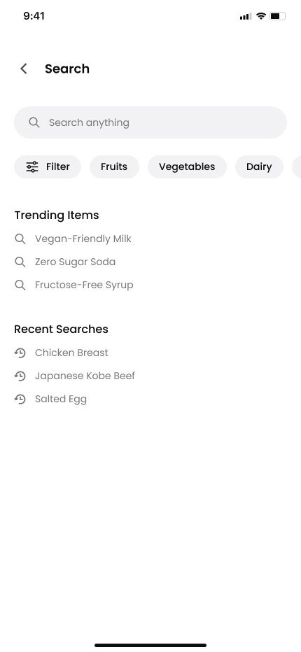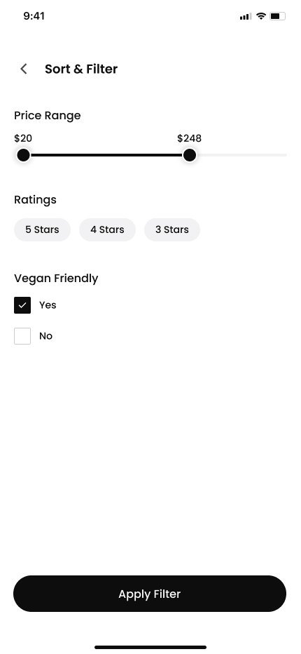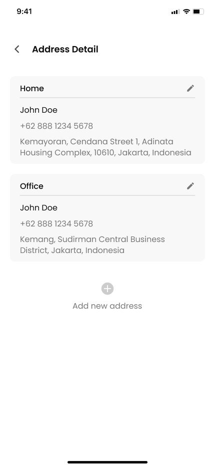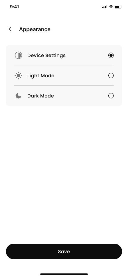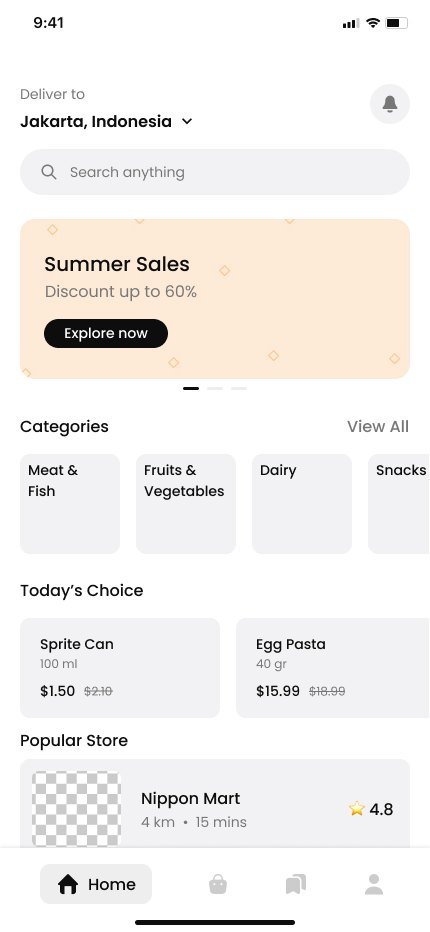

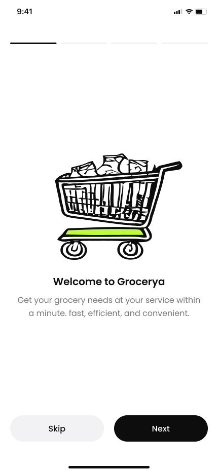
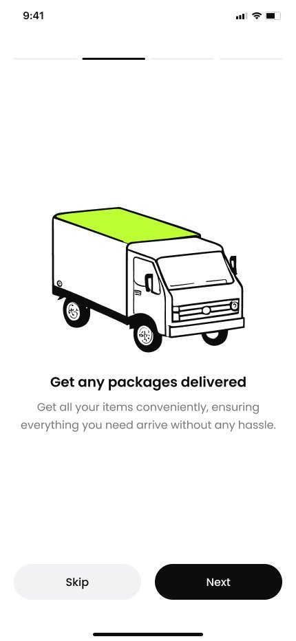
A thirty-screen grocery app covering the whole run — onboarding, discovery, cart, payment and live order tracking.
An end-to-end mobile grocery product designed across thirty screens, from first launch to a delivery arriving. The whole flow was drawn against real content and handed over as a component system rather than a set of pictures.
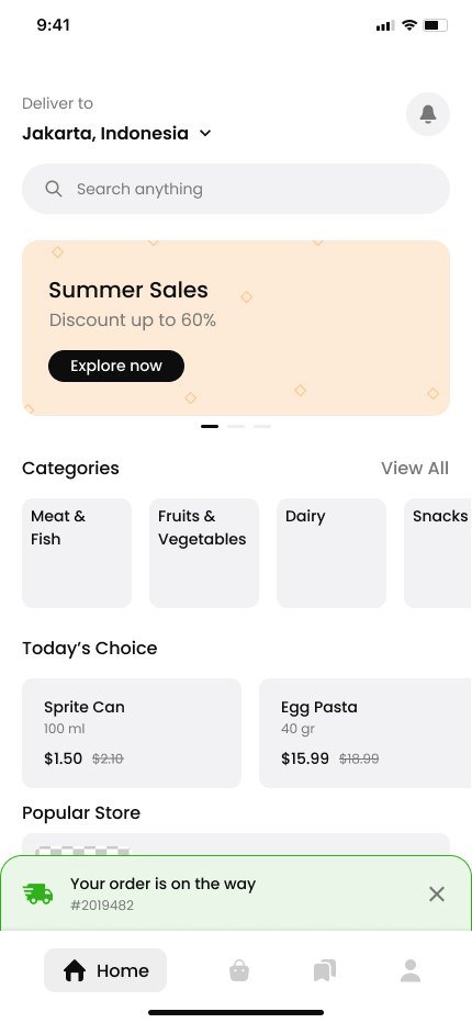
Grocery apps clutter faster than almost any other category. Categories, deals, several stores, favourites and half a dozen order states all compete for the same screen, and the home page is usually where that fight is lost.
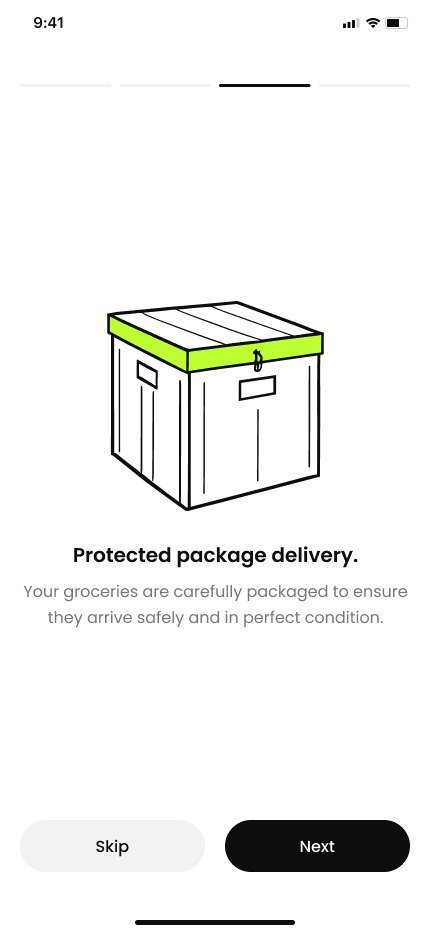
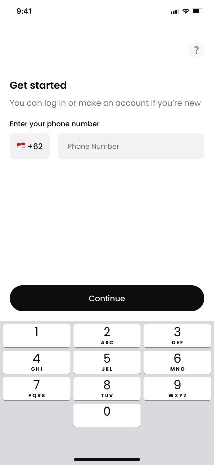
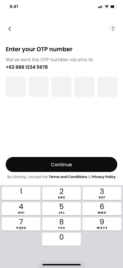
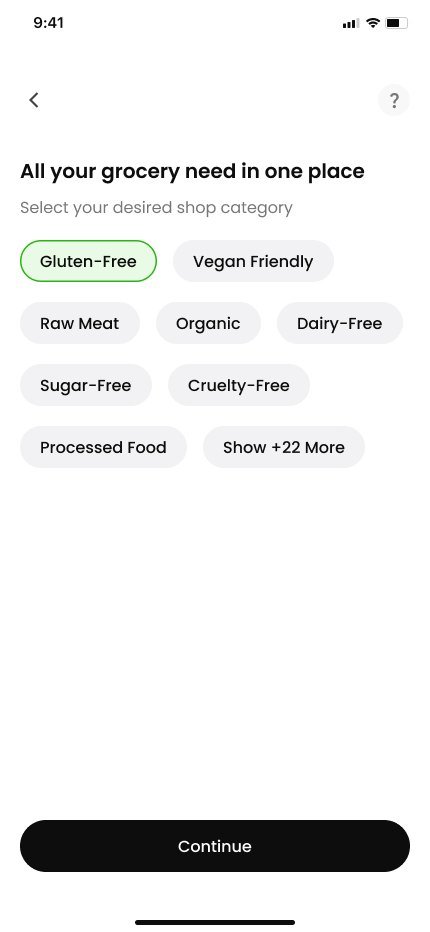
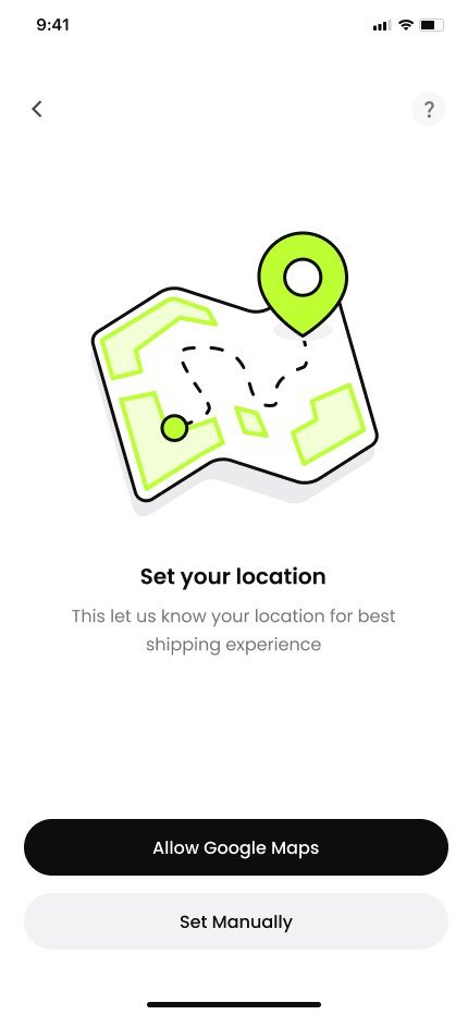
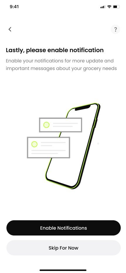
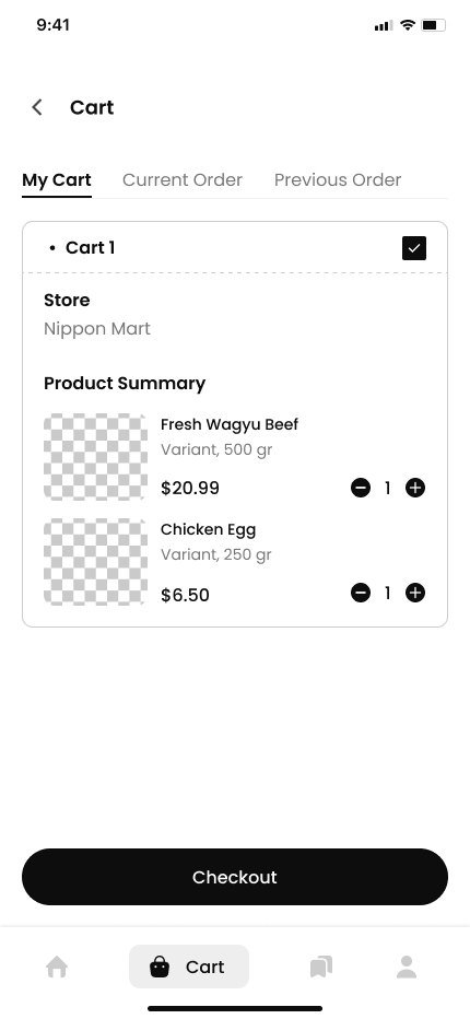
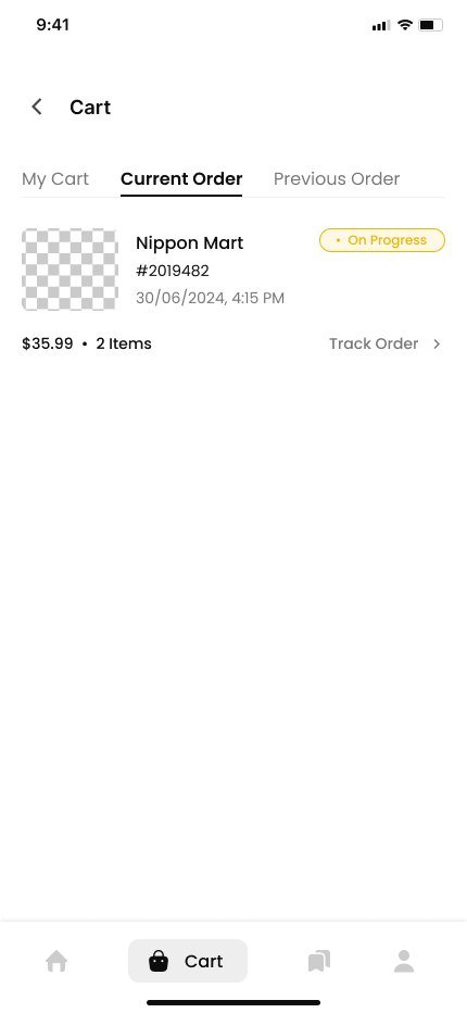
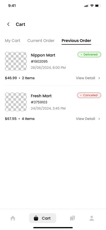
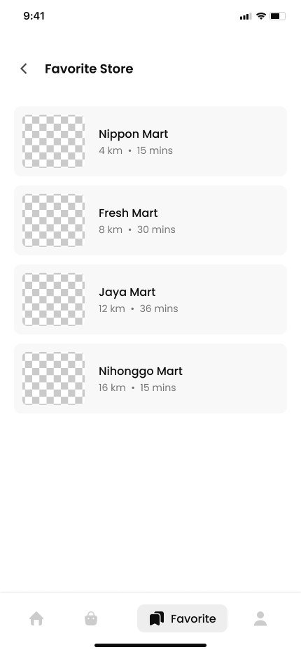
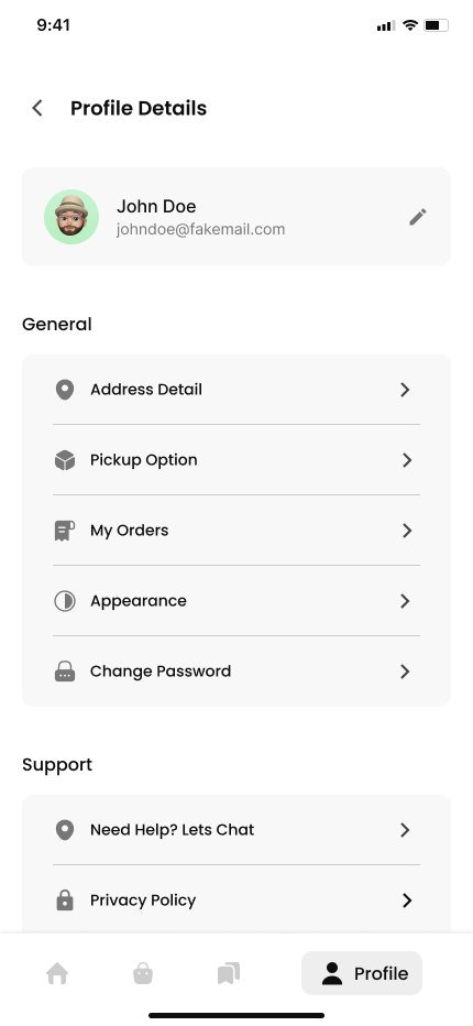
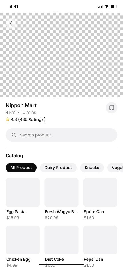
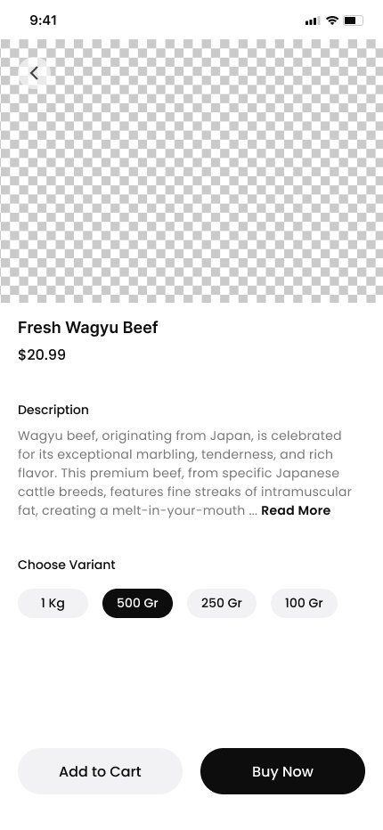
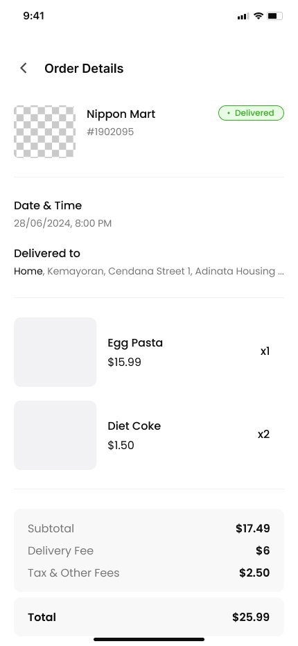
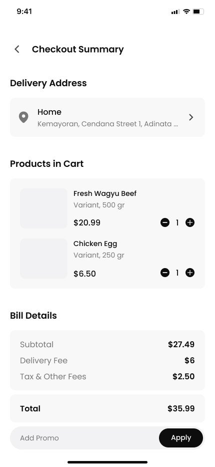
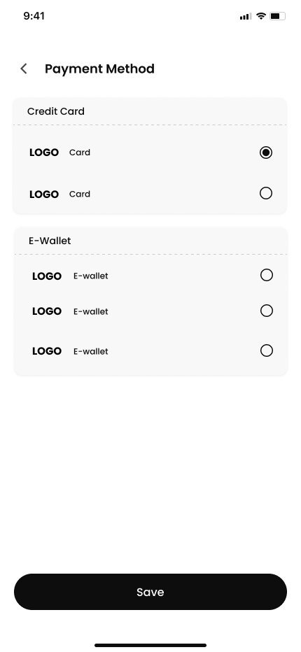
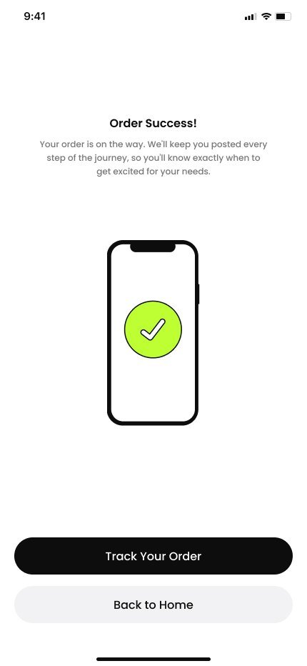
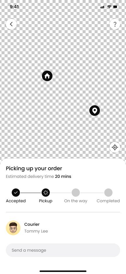
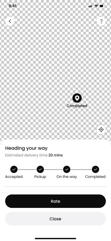
A calm, legible layout with a fixed information hierarchy, so a busy home screen and a quiet profile screen still feel like one app. The flow runs illustrated onboarding, phone and OTP sign-in, category and location setup, home, store and product browsing, cart with current and past orders, checkout, payment, live order tracking, and the account screens behind it — search, filters, addresses, favourites and appearance.